Latest topics
» Mod Conference Room is Feeling Weakby V Wed Jun 09, 2021 10:52 am
» First post of 2017 ?!
by Celstrial Sat Nov 04, 2017 12:06 pm
» First Post of 2016?
by Payton Wed May 25, 2016 3:57 am
» Merry Xmas
by Altera Fri Dec 25, 2015 1:13 pm
» Your Awesome Pictures X
by Rage Thu Dec 17, 2015 2:57 am
» TR
by DigDog Tue Oct 27, 2015 7:07 am
» Wonderful Memories
by Mrsebi Mon Oct 12, 2015 10:06 pm
» Cool New Music
by Mrsebi Sat Oct 10, 2015 12:48 am
» Posting in these forums
by Mrsebi Sat Oct 10, 2015 12:40 am
Top posting users this week
| No user |
OUR DOMAIN IS ABOUT TO EXPIRE
Sun Apr 27, 2014 8:43 am by V
but I renewed it.
what have YOU done today, TR?
also I'm not sure if heartbleed effected us but you should probably not change your password, the jitterbug gang are working hard and they need …
what have YOU done today, TR?
also I'm not sure if heartbleed effected us but you should probably not change your password, the jitterbug gang are working hard and they need …
Comments: 30
Log in
Who is online?
In total there are 15 users online :: 0 Registered, 0 Hidden and 15 Guests :: 1 BotNone
Most users ever online was 427 on Fri Oct 04, 2024 2:47 am
Search
A Digital Art Question
2 posters
Page 1 of 1
 A Digital Art Question
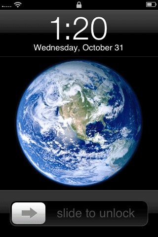
I have been working on creating a 100% from-scratch 2G iPod Touch, as far as the visual goes, I'm done. BUT I want to upload an editable file so people can use it for whatever they want. My problem is that the elements on the screen do not look the same with different backgrounds. The "slide to unlock" bottom bar, and time/date top bar don't look the same overlay-ish translucent on all backgrounds. Anybody got a tip that could help, like a layer mode or something?
Here is the picture if you don't know what I'm talking about: https://i.servimg.com/u/f69/14/99/77/01/ipod11.png
Here is the picture if you don't know what I'm talking about: https://i.servimg.com/u/f69/14/99/77/01/ipod11.png
 Re: A Digital Art Question
Hey Darre,
first of all- Nice work! It's great to see some more texture/detail work in PS. Anyway, on to your question:
It's pretty much impossible in an image format. Unless if you're incorporating it into c; objective, you can't do it solely on Photoshop. If you want more contrast on black backgrounds, you could apply the "hard light" or "overlay" styles to add more of a contrast. Of course, this would also apply to other colors and image backgrounds.
You should also have the colors of the bottom bar and date bar #000000, if you haven't already.
Also note that the original iPhone launch screen has solid black, 1px dropshadows and gradients for the two elements you're having trouble with:

 Re: A Digital Art Question
That is extremely helpful and probable solves my problem but I have another problem that I can't seem to solve. I am using GIMP, not Photoshop if you would like to know. Anyway my blend tool is completely screwed. The gradient isn't balanced, as in it switches from the primary colour to a middle colours and stays as the middlish colours extraordinarily long and then making it to the secondary colour right at the end. The gradient looks screwed up. And no matter what I do I can't get the gradient to be opaque.
 Re: A Digital Art Question
You made that with GIMP?
/respek
For your first problem, try dragging the gradient cursor out of the canvas. That should stretch it out more, thus eliminating the sharpness.
For opacity, Dockable Windows > Tool Options (Or if you have an older version, these options should be right on your dialog window.), and just adjust the opacity slider. If that doesn't work, adjust the opacity of the layer itself?
 Re: A Digital Art Question
That's the thing! I know how to do all of that stuff and I've screwed around with that and more trying to get it correct. Although it turns out it only does it for this image (/spooky) and with some messing around like altering with the colours chosen to get different colours, layer modes and other things I can replicate original results as if the blend tool actually worked. Sooooo that's fixed. The first problem is fixed. And you V have been a HUGE help. I will upload the final image and editable file maybe even pack within days. Lock please.
 Similar topics
» [Digital Art] Floating on a river of Art....
» Serious Question
» I have a question...
» Serious Question [Very srs]
» Quick question.
» Serious Question
» I have a question...
» Serious Question [Very srs]
» Quick question.
Page 1 of 1
Permissions in this forum:
You cannot reply to topics in this forum![[TR] - Take Away Tom](https://2img.net/i/fa/empty.gif)


